- work
- sovereign
.work('Sovereign')
Scope of work
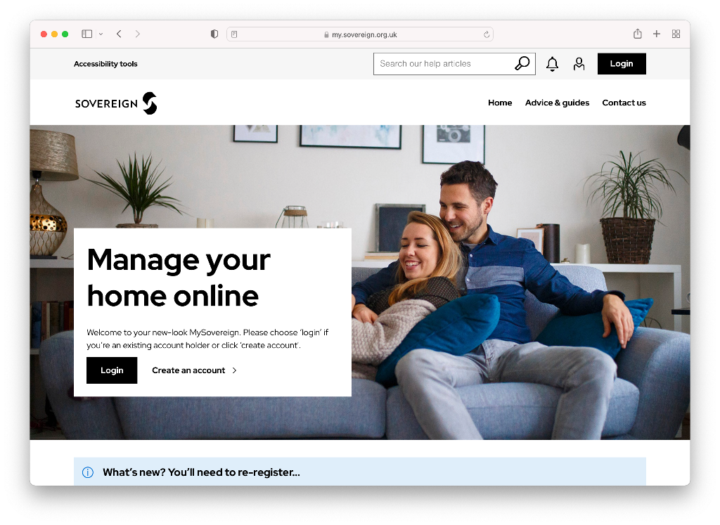
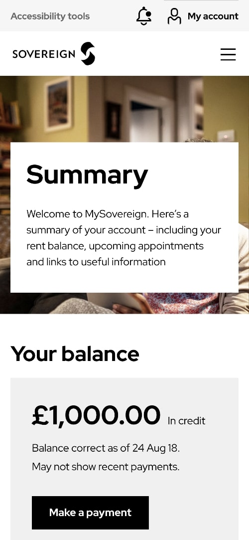
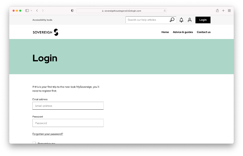
During the 6-month contract at MMT Digital, I worked on the Sovereign Housing Association account as a Senior Front-end Engineer.
Working within a multi-discipline team, alongside a junior front-end developer, my involvement was limited to the development of new front-end components for the new portal as well as working on the existing feedback app powered by ReactJs and TypeScript.
Brief
To translate the designs into responsive front-end components using best practices on a new website application.
As a senior front-end developer on the project, I also had to peer-review code, mentor/help junior developers through peer-coding as well as participate in refinement sessions and estimate deliverables.
Notable work
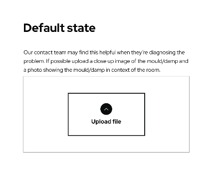
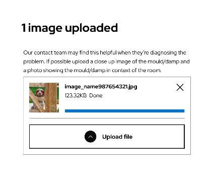
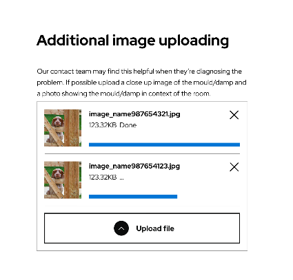
One of the more advanced front-end components I created on the Sovereign portal was the file uploader.
This file uploader worked by uploading the files to an Azure cloud bucket. There were various workflows associated with the uploader to make it secure and functional.
On initial page load, I had to make a REST API request to retrieve the upload session ID and save it to localStorage.
Then, when the user had selected a file, it was uploaded to the Azure cloud bucket via API endpoint and a document ID associated with the uploaded file was returned and saved into a hidden file input, which would be submitted with the form.
The front-end UI for the uploader was built from scratch, including the loading progress bar and the validation, which checked the file type and file size against the requirements.
This file uploader has the following states:
- Initial loading state while the file uploader is being initialised.
- Ready state, which shows the upload file button.
- File uploading state, showing the progress bar and file details.
- File uploaded state, showing file preview and an option to delete the file.
- Error states if the file uploader fails to initialise or an individual file fails to upload, showing the appropriate errors.
I made the file uploader as a standalone, re-usable component that can be dropped into any form. The file upload requirements can be overridden through data attributes, making it flexible for any use-case.
In addition, web accessibility was also taken into consideration when developing by adding the correct attributes (such as aria-label, aria-describedby, etc) to associate the file inputs with the corresponding error labels etc so that the component was screen-reader friendly.
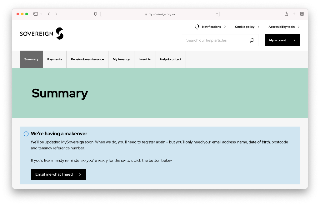
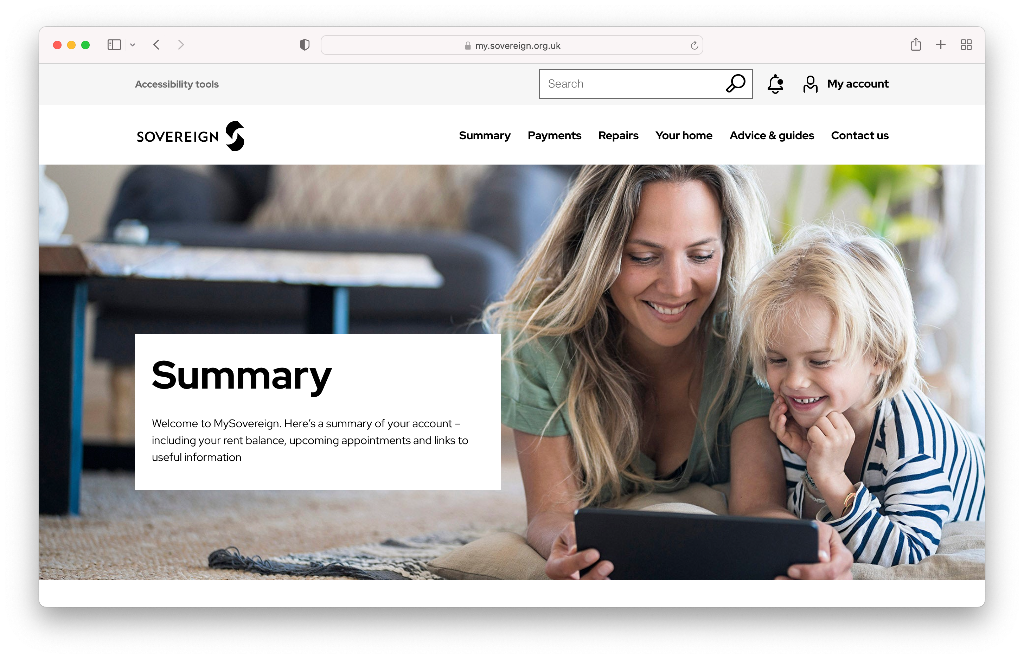
Before & after
Accessibility
Accessibility is important in any website but more so in a website such as this where the demographic is wide ranging.
Thus, for each UI component, I made sure to pay keen attention to the accessibility aspect. See some of the cases below (not a exhaustive list):
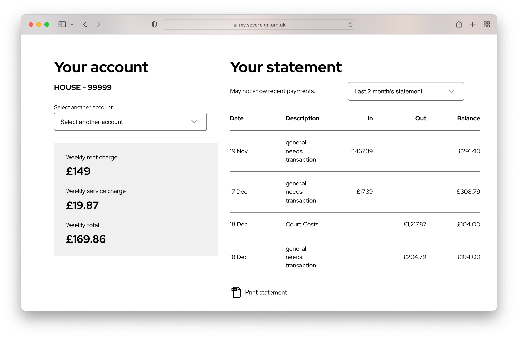
Tables In order to ensure that tabular data was clear to screen-readers, I opted to use native `<table>` element. There was an instance where a junior dev deviated from this and used HTML markup to style a table layout, in which case I requested that they added the required “role” attributes (e.g. role=“table”, role=“row”, etc) to make the table screen-readable.
Mobile navigation: When creating the slide-in mobile navigation I made sure to add the required aria- attributes to both the “hamburger” menu button and to the navigation so that screen-readers know that the button controls the toggling of the navigation.
Tab-able navigation: It was important that the entire page including the navigation (and its dropdown menus) were navigable using the keyboard for accessibility purposes.
Alt tags: Ensuring all images had alt descriptions.
Hiding aesthetic elements: Using aria-hidden to hide HTML elements that aren't needed for screen-readers (e.g icons for buttons).
Approach
I adopted modular programming for every component that I created for the website.
This means that the components created are as re-usable as possible and can be used anywhere across the website without being constrained within a specific context.
In addition, adopting modular programming also facilitates in writing clean standalone test-cases for each of the components that require JavaScript functionality.